Analyzing Red Cross's Disaster Responses
The following is an analysis I performed during the Chicago Data Dive organized by DataKind.
A Data Dive is an event where analysts and data scientists alike help non-profit organizations solve problems with data over the course of a weekend. I worked with a team helping the Red Cross.
The American Red Cross provide a variety of services: response to disasters, health and safety information to blood collection, among others. They also collect tremendous amount of data. With such an amount of data it came as no surprise that they had problems keeping track of the data and they lacked a comprehensive overview of their data.
In other words, they were missing out on the story their data could be telling them. And, as with any organization with limited resources, this is a fundamental question. For example, where should the Red Cross allocate resources to prevent disasters?
For the sake of this excercise we concentrated our analysis to disaster emergengy responses (mostly fire related). After gathering, cleaning and munging some data, we found that fires are often clustered in certain neighborhoods, providing insight on where the organization could more effectively allocate fire prevention efforts. As a no surprise, we found a strong correlation between disaster responses and per capita income, race, and population.
Over 30% of reported fires happen within 10 zipcode zones!
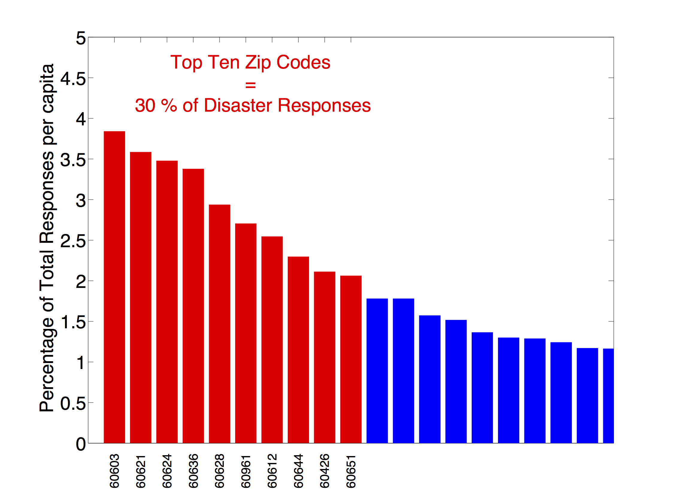
The following map shows the zipcode zones with highest reported disasters.
This analysis was part of a Data Dive organized by DataKind. You can look
here for more information about that event.